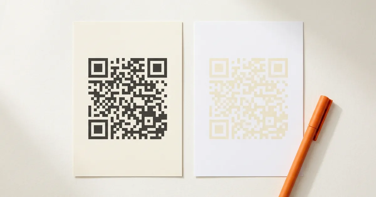
A QR code scans reliably when its pattern is clearly darker than its background. Almost any color works if you keep that relationship: dark code on a light background with strong contrast. The combinations that fail are light-on-dark (inverted) codes, red or orange patterns, and any pair a scanner reads as similar brightness.
Can a QR code be any color?
Yes, within two rules. The pattern must be darker than its background, and the brightness gap between them must be wide. A scanner measures brightness, not hue: navy or charcoal reads as dark the same way black does.
Denso Wave, the company that invented the QR code, recommends printing black on a white background as the baseline, while noting that particular color combinations can still read. Their own examples of unreadable pairs include a red code on a white background and a blue code on green.
A dark burgundy code on cream scans. Gold on white looks sharp in a mockup, but gold and white are nearly the same brightness, so most scanners see an empty square where the pattern should be.
What background colors work for a QR code?
Light backgrounds work: white and off-white are safest, and pale tints of a brand color usually pass. A background only needs to stay clearly brighter than the pattern. The further it drifts toward the middle of the brightness range, the less room the pattern has to be convincingly dark.
| Background | Verdict | Why |
|---|---|---|
| White or off-white | Reliable | Widest possible brightness gap |
| Cream, pale gray, pastel tints | Reliable | Still clearly lighter than any dark pattern |
| Light brand tint (10-20% strength) | Usually fine | Test it; some tints are darker than they look |
| Mid-tone colors (medium blue, sage, warm gray) | Risky | The gap shrinks; small print makes it worse |
| Dark colors or black (with a dark code) | Fails | No contrast at all |
| Dark colors with a light code | Unreliable | That's an inverted code; see below |
| Photos or busy patterns | Risky | Brightness varies square by square |
A transparent background inherits whatever sits behind it. Over white or cream, it behaves like a normal light background. Over a photo, the code's contrast changes from spot to spot and becomes unpredictable.
Paper behaves differently from screens, too. Ink spreads and paper tints shift colors darker or lighter than the on-screen version, so a background that barely passed on screen can fail in print.
Why do inverted QR codes fail on some scanners?
An inverted code flips the expected relationship: light pattern, dark background. Designers reach for it on dark-mode screens and black packaging because it looks native there. The problem is that inverted decoding is optional in the software doing the scanning.
The clearest evidence is in ZXing, the open-source scanning library that many Android scanner apps build on. Its source code defines a setting called ALSO_INVERTED, documented with: "If true, also tries to decode as inverted image." That setting is off unless a developer switches it on. Whether your inverted code scans in a given app literally depends on a flag its developer may never have touched.
Some scanners handle inversion. Many don't. Retail and industrial equipment is stricter still, and GS1 UK, the UK arm of the barcode standards body, advises keeping dark elements on light throughout.
If the design calls for a dark surface, don't invert the code. Give it a small light panel and print the dark code inside that. The dark aesthetic stays, and the code no longer depends on an optional setting in someone else's app.
Why do red QR codes fail on retail scanners?
Many dedicated scanners and verifiers illuminate codes with red light at 660 nanometers, per GS1's 2D barcode retail guideline. A red pattern reflects red light straight back, so to the scanner it looks as bright as the white around it. The pattern vanishes.
The same guideline says red, orange and yellow 2D barcodes are difficult to decode, and warns against red as the dark element specifically. Denso Wave's unreadable-combination example (red code, white background) makes the identical point from the inventor's side.
Your phone camera sees full color, so a red code often scans fine in testing, then fails at a checkout scanner or a warehouse verifier. If a code might ever meet retail equipment, keep red and orange out of the pattern. Both are safe as background tints, where only brightness matters.
How much contrast does a QR code need?
The numeric thresholds are published in paid standards documents. Print quality grading comes from ISO/IEC 18004:2024, the QR code specification, together with ISO's barcode quality standards, and those texts aren't free to read. GS1 UK's public guidance compresses it to one line: "High contrast is key - use dark colours on a light background, with black and white being the best combination."
For day-to-day design work, three free checks get you most of the way:
- The grayscale test. Screenshot the code and desaturate it. If the pattern doesn't jump out in black-and-white, the colors are too close in brightness.
- The distance test. Scan from arm's length under normal room light with more than one phone. A code that only scans up close usually has a contrast problem.
- The print test. Print at final size on the actual material. Screens are backlit; paper isn't.
The same logic governs codes with logos in them. A logo forces parts of the pattern to carry image colors, which is exactly why oversized or low-contrast logos break scanning. We've covered how big a logo can safely be separately.
Getting brand colors right without the guesswork
QRlfy handles this automatically. Upload a logo and it pulls the ink and background colors from the logo's own palette, keeping the dark-light relationship the scanners above require. Want a different combination? Override any color and the generator re-checks the result.
Every generated code then runs a five-level decode test, including downscaled and blurred versions that simulate a worn print and a cheap camera, before you download it. In our benchmark, 196 brand logos went through that test. All 196 passed at every level.
Generate your code free, no signup for the first try.
FAQ
Can a QR code be white? As the background, yes. A white pattern on a dark background is an inverted code, and many scanners won't read it unless their developer enabled inverted decoding.
Can a QR code background be transparent? Yes, if whatever shows through is light and even. Transparent over white or cream works like a normal light background. Transparent over photos or dark surfaces leaves the contrast to chance.
Do gradient QR codes scan? A gradient inside the dark pattern is fine when every point of it stays clearly darker than the background. A gradient that fades part of the pattern toward the background's brightness is what breaks scanning.
Does dark mode break QR codes? No, as long as the code keeps its own light panel. A dark-on-light code displayed inside a dark-mode page scans fine because its background travels with it. Recoloring the code itself to match dark mode is inversion, with the reliability problems above.
Should printed and on-screen codes use different colors? Use the same colors, but test them separately. Print shifts brightness through ink spread and paper tint, so a pair that passes on screen needs a printed test at final size before a production run.
Choose a light background and a dark pattern, keep red and orange out of the pattern itself, and scan a printed sample at final size before anything ships.